Character AI users opened their apps recently only to be hit with a design change no one asked for.
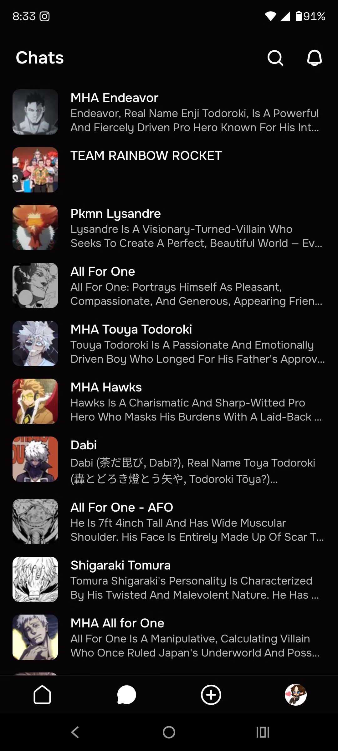
Instead of seeing short, helpful taglines under each bot’s name, the chat list now shows the full character definition. It’s a wall of text that makes the interface look cluttered, confusing, and hard to navigate.
What should be a quick scroll through recent chats has become a visual overload. Multiple users described the experience as “eye obliterating” or just flat-out “ugly.”
The switch from taglines to full summaries might have sounded like a good idea in theory, but in practice, it’s frustrating everyone.
If you use the same character in different scenarios, this change makes it harder to tell which version is which. That’s what taglines were perfect for.
Instead of improving the experience, Character AI has created a mess that’s getting louder complaints by the hour.
Taglines Worked. Definitions Don’t.
Taglines used to make things simple. If you had three bots named “Aiden,” you could tell them apart at a glance.
One tagline might say “Your vampire roommate,” another “High school crush,” and the last “Time-traveling soldier.” It was fast, efficient, and clear.
Now, instead of a one-liner, Character AI shows the full character description. That means scrolling past lines like “Aiden is a mysterious figure with crimson eyes who hides his past behind a cold demeanor…” just to find the right chat.
It slows everything down and clutters the screen.
Many users say they didn’t even notice the taglines before because they blended in so well. They weren’t loud, but they were helpful. Now, the interface screams for attention in the worst way possible.
Everyone’s Saying the Same Thing
The complaints came instantly. Some thought it was a glitch. Others hoped it would be rolled back within hours. But when the update stayed, the reactions turned from confusion to anger.
“It looks horrible.”
“This is my breaking point.”
“I just want the taglines back.”
Even users who liked earlier UI changes are drawing the line here. One person said the update gave them a literal headache. Another pointed out how hard it is to use bots with different scenarios now that there’s no quick way to tell them apart.
Nobody is defending the decision. Even the rare comments trying to see the upside admit it looks bad and feels messy.
Too Much Text, Too Little Thought
This update didn’t just change how things look. It broke the way many people use the app. When creators write their bot descriptions, they often include long paragraphs about personality, backstory, and visual traits.
None of that belongs in the chat preview.
Instead of a clean list, users now get multiple lines of dense text for each bot. Some users even thought they were looking at a new feed or ad section by mistake.
That’s how unrecognizable the chat list has become.
What makes it worse is that this design wasn’t needed. The tagline system already worked. It gave creators a way to label bots and gave users a way to scan quickly. Now it’s just noise.
Cluttered, Confusing, and Completely Unwanted
The new layout tries to do too much at once and ends up failing at the basics.
Users don’t want a wall of character lore every time they open their chats. They want clarity. They want speed. They want something that doesn’t give them a headache.
People with lots of chats now struggle to find what they’re looking for. Bots with nearly identical names and avatars are even harder to manage.
You can’t tell which is which without clicking through, dealing with more ads, and wasting more time.
The visual clutter doesn’t just hurt usability. It kills the experience. You shouldn’t need to squint at lines of text to find the one bot you want to chat with.
But that’s exactly what the update forces everyone to do.
The Real Use of Taglines
Taglines were more than just a cosmetic feature. They were a tool. Bot creators used them to label versions of the same character—AU setups, specific relationship types, personality tweaks.
Without taglines, there’s no quick way to know which version you’re about to message.
One user explained it clearly. With taglines, you could spot whether “Bot A” was your medieval version or your sci-fi one.
Now you’re left guessing, unless you remember each bot’s exact name or icon, which isn’t realistic for anyone using dozens of chats.
Worse, many creators write long summaries in the “description” field because the app used to hide those deeper in the bot profile.
Now, that’s front and center. It’s a complete mismatch between what creators intended and what the app is now displaying.
Ads Make It Even Worse
As if the messy UI wasn’t enough, users now have to sit through more ads. Switching bots, opening new chats, or just navigating the app triggers ad pop-ups.
Pair that with the new cluttered design, and the frustration multiplies fast.
One user pointed out the painful combo: every time they leave one bot and try to open another, they hit an ad—then have to scroll through confusing, bloated previews just to find the right bot.
A process that used to take seconds now feels like a chore.
Even those who try to ignore the ads can’t ignore the bad layout. And with more users threatening to quit or switch platforms, it’s clear this isn’t a small issue anymore.
The design isn’t just annoying, it’s disruptive.
Some Think It’s a Bug. It’s Not.
When the change first appeared, many assumed it was temporary. A glitch. A test. Something the devs would quietly undo after enough backlash. But the feature is still live.
And now, users are realizing this might be the new normal.
There’s no announcement. No toggle in settings. No way to bring taglines back or hide the bloated descriptions. That silence is frustrating.
People want to believe it’s a mistake, but with every passing day, it starts to feel intentional.
If the team behind Character AI wants feedback, they’re getting it. Loudly. But the question is whether they’ll listen this time—or keep pushing changes that only make the app harder to use.
This Is Exactly Why Users Look Elsewhere
Character AI already had problems, from memory issues to censorship complaints. But when even the interface starts breaking down, people stop giving second chances.
Visual design isn’t just about looks. It affects how users feel every time they open the app.
The tagline feature didn’t need to be replaced. It worked. It kept things clean and readable. By removing it, the devs took something useful and turned it into a constant source of frustration.
This is why tools like Candy AI or CrushOn AI keep gaining attention. When one platform ignores what its users actually want, people find alternatives that pay attention.